Menu

Slides

Find a page by what it says or how it’s put together.
Filter

114 slides

Slide results

Pink and cyan frames surround a creator portrait and the white Irreplaceable Instinct title on TikTok Next’s black 2026 report cover.
Irreplaceable Instinct · TikTok · Page 1
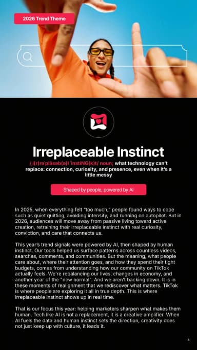
A creator photograph leads into the trend-theme title and a concise narrative on a black portrait page.
Irreplaceable Instinct theme · TikTok · Page 4
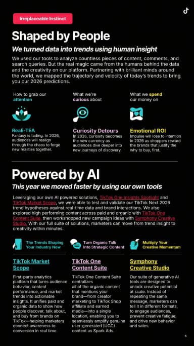
Cyan and pink labels structure an explanation of the report's methods and tools on black.
Shaped by people, powered by AI · TikTok · Page 5
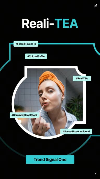
A creator portrait sits inside layered cyan frames and hashtag labels beneath a large trend title.
Reali-TEA · TikTok · Page 6
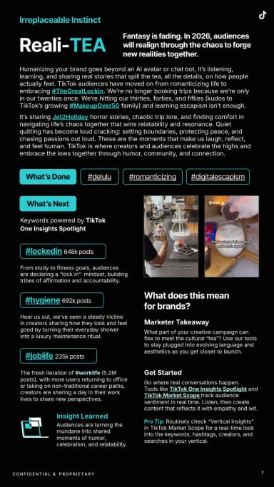
Headings, hashtag capsules, creator examples and cyan highlights organise trend evidence in narrow columns.
Reali-TEA signals · TikTok · Page 7
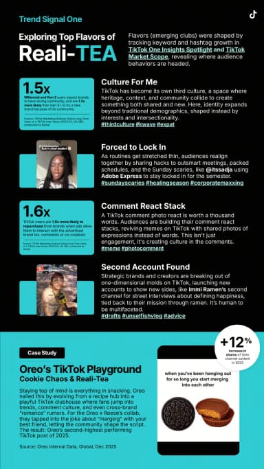
Three cyan statistic blocks and creator examples explain Reali-TEA signals above an Oreo campaign case study at the foot of the page.
Exploring Reali-TEA · TikTok · Page 8
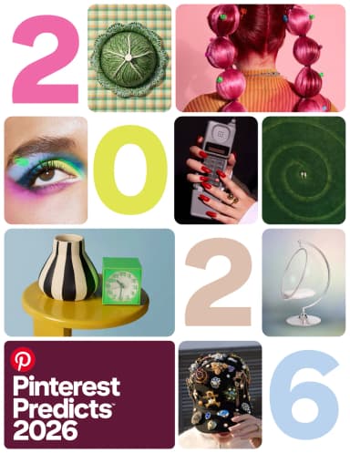
Pinterest Predicts 2026 uses rounded image tiles and pastel year numerals to combine fashion, food, interiors and beauty on a portrait cover.
Pinterest Predicts 2026 · Pinterest · Page 1
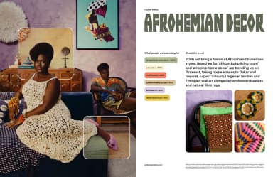
Layered room photographs and textile details face the Afrohemian Decor heading, search-growth labels and supporting trend text.
Afrohemian Decor · Pinterest · Page 4
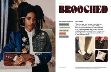
A large fashion portrait and inset accessory images accompany an expressive heading and search indicators.
Brooched · Pinterest · Page 5
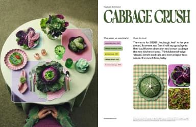
A cabbage-themed food still life is paired with green display type and compact search-growth figures.
Cabbage Crush · Pinterest · Page 6
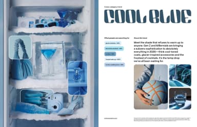
Blue product and beauty photographs create a colour-led collage beside a large trend title and audience signals.
Cool Blue · Pinterest · Page 7
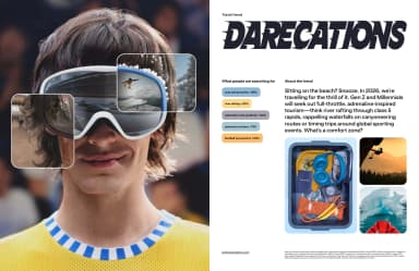
An adventurous travel portrait and inset photographs accompany an italic display heading and search-growth labels.
Darecations · Pinterest · Page 8
Strava’s white Year in Sport 2025 title sits over sculptural orange graphics and small activity icons on a dark portrait cover.
Year in Sport 2025 · Strava · Page 1
A yellow trend statement sits over a dark green-to-yellow field with a short introductory paragraph below.
Running rules, walking rises · Strava · Page 4
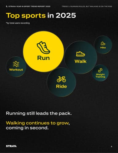
Differently sized labelled circles and simple activity icons compare the most recorded sports.
Top sports in 2025 · Strava · Page 5
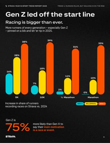
Rounded coloured bars compare race participation by generation, followed by a large motivation statistic.
Gen Z led off the start line · Strava · Page 6
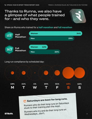
Two horizontal bar comparisons and a row of scaled circles explain training patterns and long-run days.
Training with Runna · Strava · Page 7
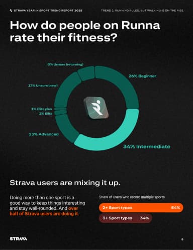
A segmented teal ring around the Runna mark compares reported fitness levels, followed by a separate bar comparison of people recording multiple sports.
Fitness levels and multiple sports · Strava · Page 8
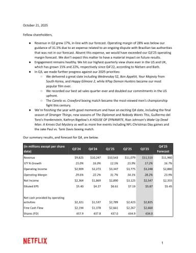
Netflix’s letter dated 21 October 2025 opens with bullet-point business highlights and a compact financial table above the red wordmark.
Q3 2025 shareholder letter · Netflix · Page 1
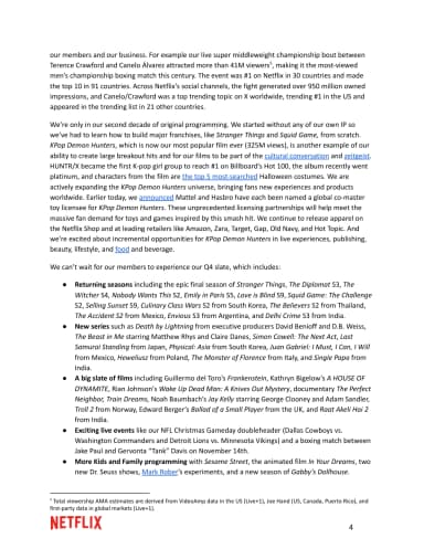
Plain paragraphs and a short content list use whitespace, bold subheadings and footnotes to organise the narrative.
Content and engagement · Netflix · Page 4
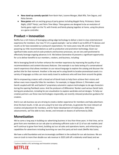
Short subheadings divide a text-led account of product changes and advertising with a red wordmark at the foot.
Product, innovation and monetization · Netflix · Page 5
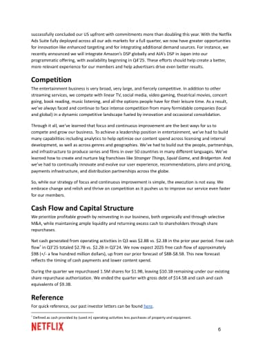
Black body text and bold section labels group the competition, cash-flow and capital-structure discussion.
Competition and capital structure · Netflix · Page 6
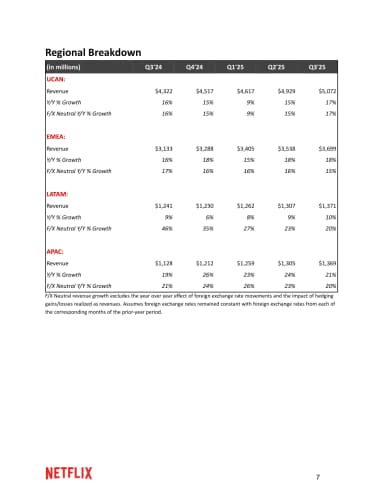
A compact table compares regional revenue and growth across quarters with red group labels.
Regional breakdown · Netflix · Page 7
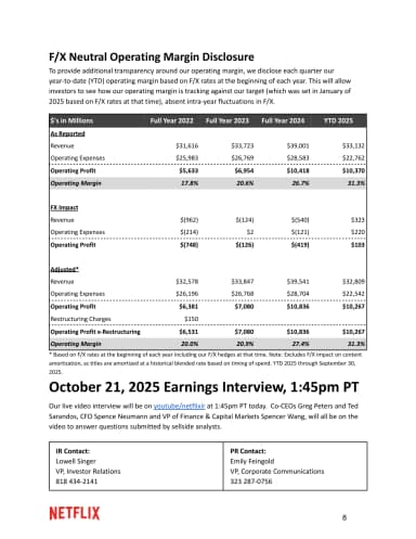
A grey table compares foreign-exchange-neutral operating margins above earnings-interview details and two investor contact blocks.
FX-neutral operating margin disclosure · Netflix · Page 8
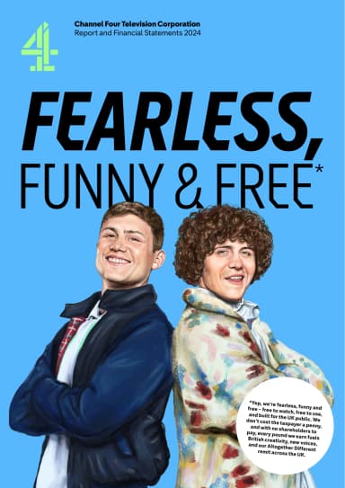
A saturated blue cover sets a large white headline against Channel 4's distinctive graphic identity.
Fearless, funny and free · Channel 4 · Page 1
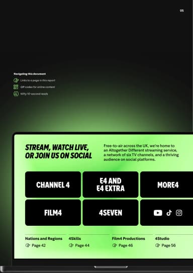
A playful guide uses labels, links and colour to explain how to use the report.
Navigating this document · Channel 4 · Page 7
Large green typography gives the public-service purpose a page of its own.
We're here to create change through entertainment · Channel 4 · Page 8
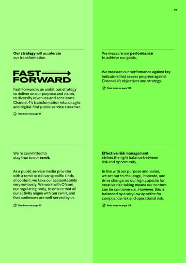
A clear strategy page pairs a bold headline with explanatory copy and structured information.
Fast Forward strategy · Channel 4 · Page 9
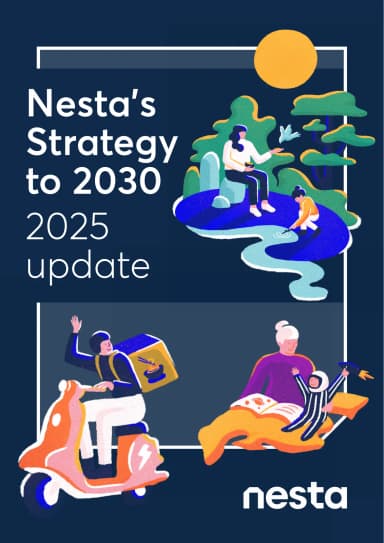
Colourful illustrated people and landscapes frame Nesta’s Strategy to 2030 title and 2025 update label on a deep-blue portrait cover.
Strategy to 2030: 2025 update · Nesta · Page 1
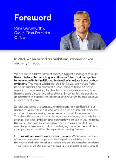
A blue portrait banner introduces the chief executive's foreword above a restrained column of black body text.
Foreword · Nesta · Page 4
The continuing foreword sets out mission, policy and organisational priorities in a long-form text column with a small Nesta mark.
Deepening missions and policy work · Nesta · Page 5
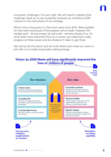
The concluding foreword leads into a compact coloured framework linking Nesta's missions, roles and capability priorities.
Our missions and roles · Nesta · Page 6
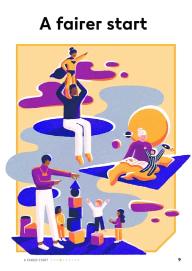
A yellow-and-purple illustration of children and adults introduces Nesta’s early-years mission beneath the black A fairer start heading.
A fairer start · Nesta · Page 10
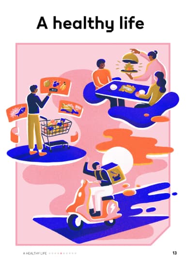
People, food and exercise fill a pink-and-purple illustrated scene beneath Nesta’s A healthy life mission title on white.
A healthy life · Nesta · Page 14
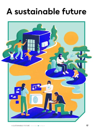
A green-and-yellow illustration links homes, energy and people beneath Nesta’s A sustainable future mission heading on white.
A sustainable future · Nesta · Page 18
An illustrated farm landscape sits behind Chipotle’s Cultivate a Better World headline and 2024 Sustainability Report Executive Summary label.
Cultivate a Better World · Chipotle · Page 1
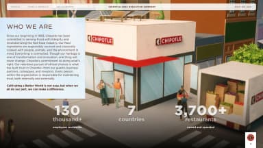
A restaurant photograph supports company context and large store, country and workforce figures.
Who we are · Chipotle · Page 4
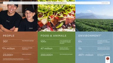
Three colour-coded columns group Chipotle’s People, Food & Animals, and Environment highlights beneath staff, food and farm photographs.
People, food and animals, and environment · Chipotle · Page 5
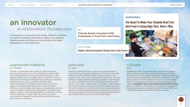
A pale-blue editorial page groups Chipotle’s restaurant-technology and digital-innovation examples with text callouts, diagrams and product imagery.
Restaurant and digital innovation · Chipotle · Page 6
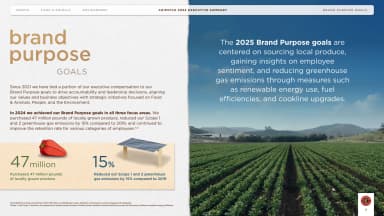
A two-part layout contrasts purpose targets and small ingredient illustrations with a large agricultural photograph.
Brand purpose goals · Chipotle · Page 7

White values statements and fine connecting rules occupy the sky above a blue-toned mountain and farmland photograph.
Our values · Chipotle · Page 8
Universal Music Group’s Capital Markets Day 2024 title sits in a blue rounded panel above a radiating black motif and a cream wordmark band.
Capital Markets Day 2024 · Universal Music Group · Page 1
Two monochrome archival photographs place a house exterior beside a crowded recording room in rounded frames.
A history of recording · Universal Music Group · Page 4
A dense montage brings performers and recording artists together in a grid of rounded photographic tiles.
Artists across generations · Universal Music Group · Page 5
Four black-and-white photographs show historic recording equipment and studio work in rounded rectangular frames.
Recording technology over time · Universal Music Group · Page 6
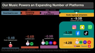
Coloured bands connect stages of music distribution to platform logos and audience figures against a black background.
An expanding number of platforms · Universal Music Group · Page 12
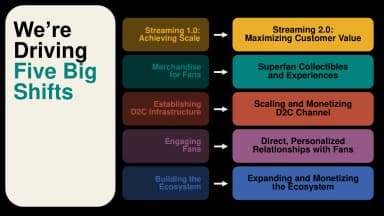
Five pairs of coloured panels and small white arrows connect existing music-business models to streaming, fan, service and geographic priorities.
Five big shifts · Universal Music Group · Page 60
Intuit Mailchimp’s yellow UK-edition cover sets Brand Trust in the Age of Information Overload in large serif type beside geometric line art and a Sapio credit.
Brand Trust in the Age of Information Overload · Intuit Mailchimp · Page 1
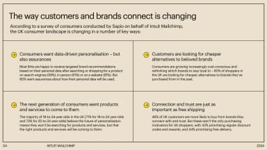
A cream two-by-two panel summarises Mailchimp’s survey themes of consumer trust, connection and preferences, separated by fine rules and yellow markers.
How customers and brands connect · Intuit Mailchimp · Page 4
A black chapter divider balances a large white serif title with a thin-line geometric construction.
The marketing landscape in 2024 · Intuit Mailchimp · Page 5
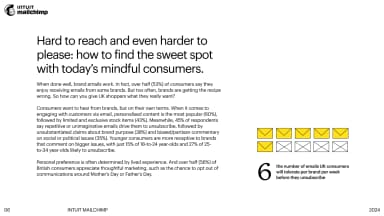
A text-led page about UK consumers’ brand-email preferences uses a large sans-serif heading and six small envelope icons as its visual anchor.
Finding the sweet spot with consumers · Intuit Mailchimp · Page 6
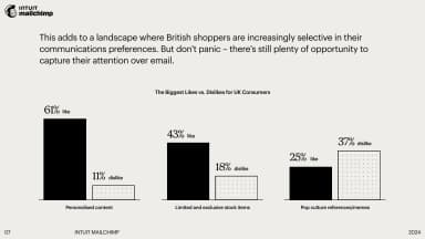
A restrained grouped bar chart compares personalised content, limited stock and pop-culture references in black and dotted bars.
Consumer likes and dislikes · Intuit Mailchimp · Page 7
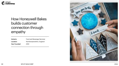
A large product photograph of decorated cakes sits beside a brief customer case study and company facts.
Honeywell Bakes · Intuit Mailchimp · Page 8
A multicoloured arch frames an illustrated landscape beside the report title on a dark blue cover.
PORTALS: to beautiful futures · Omidyar Network & Guild of Future Architects · Page 1
A wide cover combines a centred report title with fine orbital lines on a pale, orange-tinted background.
Ideas Report 2021 · WeTransfer · Page 1
A survey introduction uses a large statistic and a short centred statement, surrounded by open space.
10,000 creative voices · WeTransfer · Page 2
A lavender overview uses four short sections and irregular dotted lines to connect the report themes.
Four provocations · Omidyar Network & Guild of Future Architects · Page 4
A green chapter divider combines a large serif title with a circular collage of people and landscape.
Real Promises · Omidyar Network & Guild of Future Architects · Page 5
A methodology page pairs oversized stacked typography with a small explanatory paragraph and yellow colour field.
The be-all and end-all of creative reports · WeTransfer · Page 5
A two-part green page pairs a question about shared well-being with a floating cloud and fine vertical divider.
Shared well-being as a standard of success · Omidyar Network & Guild of Future Architects · Page 6
A speculative narrative balances a short verse against two columns of smaller body text.
Imagination: a future neighbourhood · Omidyar Network & Guild of Future Architects · Page 7
A continuation of the narrative pairs small columns of text with a green circle, clouds and line illustration.
Imagination: continuing the story · Omidyar Network & Guild of Future Architects · Page 8
A dark chapter divider uses a huge outlined chapter number with a small title inside it.
New creative world order · WeTransfer · Page 8
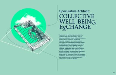
A speculative exchange is explained through a large serif heading, body text and an isometric architectural drawing.
Collective Well-being Exchange · Omidyar Network & Guild of Future Architects · Page 9
A chapter opening places a large title inside a soft rectangle with thin elliptical lines.
There’s a new creative world order · WeTransfer · Page 9
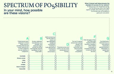
A full-page matrix combines several futures with rows of indicators and a legend.
Spectrum of possibility · Omidyar Network & Guild of Future Architects · Page 10
An editorial research page combines a large headline, three text columns and a small highlighted list.
Creativity is dying in the West · WeTransfer · Page 10
Two oversized percentages anchor a research page, balanced against country annotations and a narrow list.
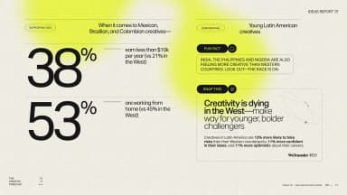
Creative careers across markets · WeTransfer · Page 11
A large stacked sentence sits beside a cluster of three orange spheres labelled with survey percentages.
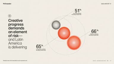
Creative progress demands risk · WeTransfer · Page 12
An atmospheric landscape photograph supports spare, widely tracked title typography.
Four plausible futures · Arup · Page 1
A full-page photograph carries a single large quotation to bridge the introduction and framework.
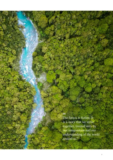
The future is fiction · Arup · Page 7
A two-axis matrix places planetary health against societal conditions and names four plausible futures.
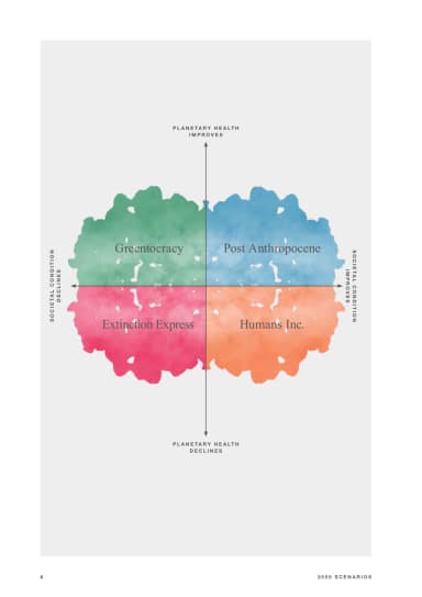
Four future scenarios · Arup · Page 8
A disciplined editorial page explains the framework's purpose with clear title and body-copy hierarchy.
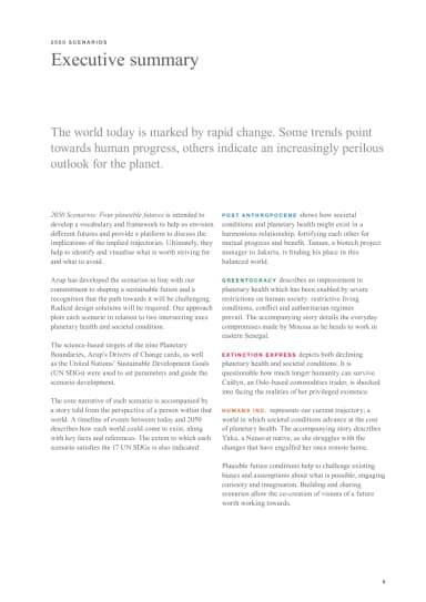
Executive summary · Arup · Page 9
A soft, multicolour abstract image and strong white title create a distinctive report cover.
Accenture Life Trends 2025 · Accenture Song · Page 1
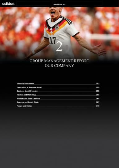
A football photograph fades into black behind the Our Company chapter title and section contents, beneath the adidas Annual Report 2025 navigation strip.
Our Company · adidas · Page 1
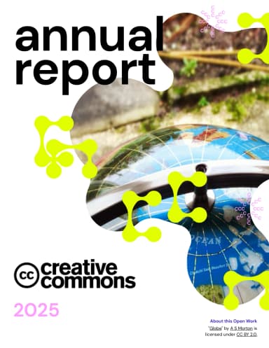
A documentary photograph and large annual-report title establish the report's open-culture theme.
Annual Report 2025 · Creative Commons · Page 1
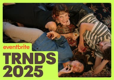
A fluorescent-yellow frame wraps a photograph of eventgoers above Eventbrite’s oversized black TRNDS 2025 title.
TRNDS 2025 · Eventbrite · Page 1
A black cover frames bright abstract shapes with large white title type.
State of the Designer 2025 · Figma · Page 1
A quiet home photograph and compact title introduce the changing-world theme without cropping the image.
Moving pieces · IKEA / Ingka Group · Page 1
A dark green cover uses oversized pink and white type with Spotify's report identity.
Equity & Impact Report 2025 · Spotify · Page 1
Oversized black Creativity for all typography spreads across a peach landscape cover, with the V&A mark and 2026–2030 strategy subtitle below.
Creativity for all · V&A · Page 1
A spare cover states the plan period and April 13, 2023 draft status, with a visible image credit.
Annual Plan 2023–24 · Wikimedia Foundation · Page 1
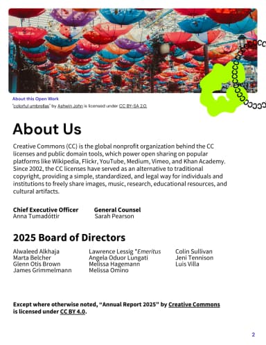
An image-led opening explains Creative Commons and visibly credits the photograph and its license.
About us · Creative Commons · Page 2
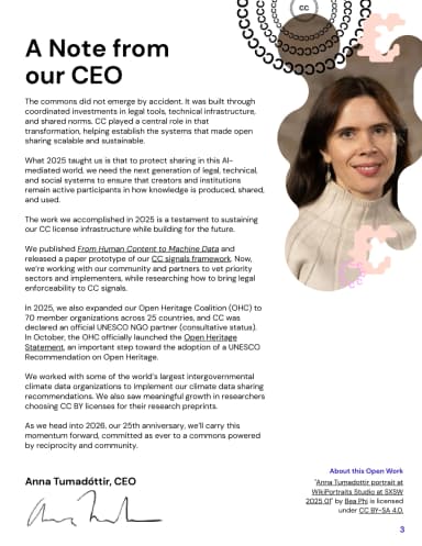
A leadership note combines a large heading and compact body copy with a portrait and playful illustration.
A note from our CEO · Creative Commons · Page 3
An editorial summary introduces the five shifts in digital behaviour with ample spacing and hierarchy.
Executive summary · Accenture Song · Page 4
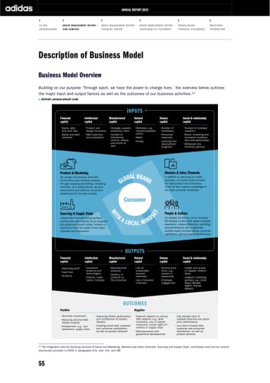
A blue consumer-centred diagram maps brand inputs, business activities and outcomes on a white portrait page.
Business model overview · adidas · Page 4
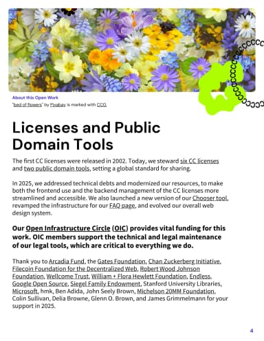
A floral image and text explain the license and public-domain tools, with the source credit printed on the page.
Licenses and public domain tools · Creative Commons · Page 4
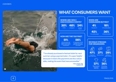
White panels of event-discovery and ticket-buying statistics sit beside an open-water swimming photograph on a saturated-blue background.
What consumers want · Eventbrite · Page 4
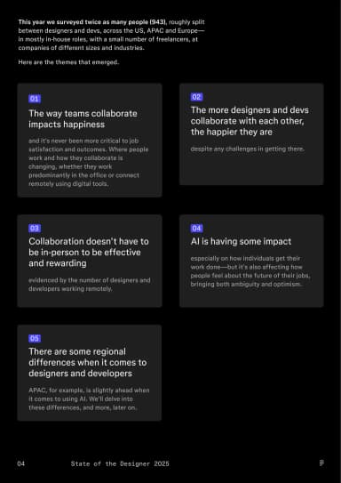
Compact summary cards turn survey findings into a modular, easy-to-scan overview.
Designer and developer trends · Figma · Page 4
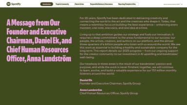
A leadership introduction combines a portrait with large display text and readable body copy.
A message from leadership · Spotify · Page 4
The V&A’s founding purpose, to educate designers, manufacturers and the public in art and design, fills a muted green slide in large black type.
The founding purpose · V&A · Page 4
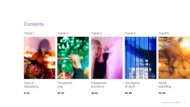
A numbered contents system groups the five themes into a scan-friendly roadmap.
Five trends · Accenture Song · Page 5
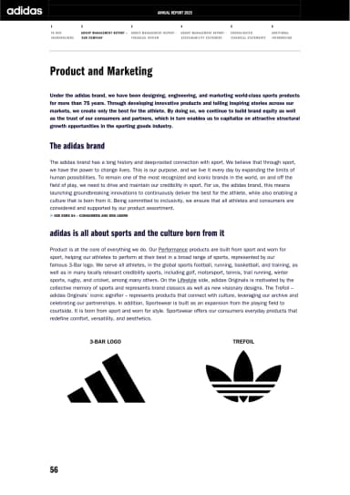
Two adidas marks anchor a brand explanation beneath the report's consistent black navigation strip.
Product and Marketing · adidas · Page 5
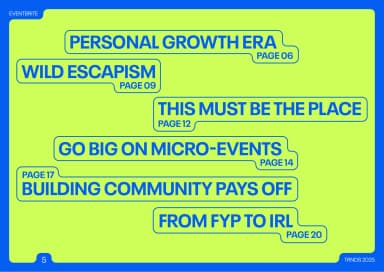
Six blue-outlined trend labels step down a fluorescent-yellow contents page with visible page references.
Six event trends · Eventbrite · Page 5
A lime section page gives the hybrid-work finding a large headline above a short supporting explanation.
Hybrid drives happiness · Figma · Page 5
The report mission is set in a high-contrast editorial composition with bold colour accents.
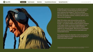
Delivering creativity to the world · Spotify · Page 5
The V&A’s vision of a society that appreciates and practises creativity appears in large black type high on a muted green page.
Our vision · V&A · Page 5
An image-led first-trend opener uses large type to mark the transition from overview to analysis.
Cost of hesitations · Accenture Song · Page 6
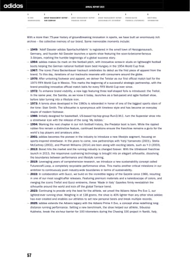
A chronological text sequence records product and sporting milestones in the brand's history.
An archive of innovation · adidas · Page 6
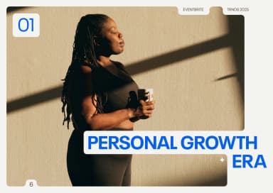
A photograph of a woman holding a mug sits inside a chapter frame, with Eventbrite’s blue Personal Growth Era title crossing the lower edge.
Personal growth era · Eventbrite · Page 6
Survey figures and explanatory columns show what is improving workplace satisfaction.
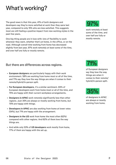
What’s working? · Figma · Page 6
A structured index condenses ten findings into short statements with generous spacing and light visual hierarchy.
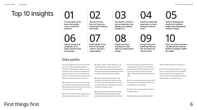
Top 10 insights · IKEA / Ingka Group · Page 6
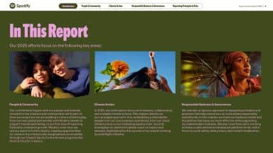
A three-part overview uses photographs and short text to introduce people, climate action and responsible business.
In this report · Spotify · Page 6
The V&A’s mission to champion art, design and creativity for everyone is set as a large black statement on a muted green field.
Our mission · V&A · Page 6
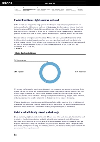
A blue doughnut chart shows the product mix between explanatory sections about franchises and local relevance.
Product franchises · adidas · Page 7
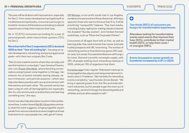
Two editorial columns sit beside a blue-outlined insight panel, with key survey findings highlighted in blue.
Personal growth insights · Eventbrite · Page 7
A peach section divider uses a large two-line heading and generous negative space.
Strategic priorities and objectives · V&A · Page 7
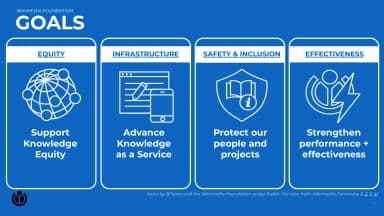
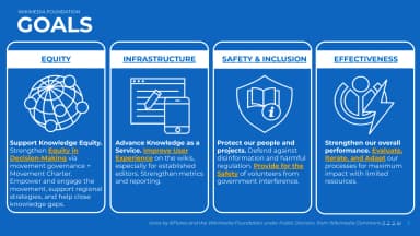
Blue goal blocks connect equity, infrastructure, safety and effectiveness in a single overview framework.
Wikimedia Foundation goals · Wikimedia Foundation · Page 7
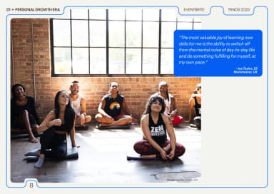
A yoga-class photograph sits below a blue quotation card about learning new skills, inside the chapter’s stepped blue outline.
Learning new skills · Eventbrite · Page 8
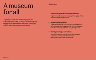
A coral page pairs a large strategic statement with three numbered objectives in a second column.
A museum for all · V&A · Page 8
Large blue blocks expand the safety goal into short actions using the deck's repeated visual language.
Protect our people and projects · Wikimedia Foundation · Page 8
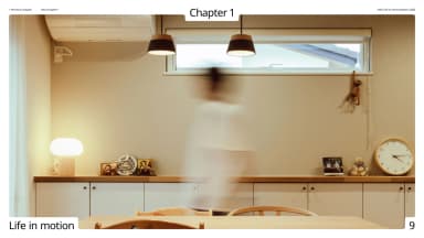
A full-page domestic photograph opens the first chapter with restrained overlaid type.
Life in motion · IKEA / Ingka Group · Page 9
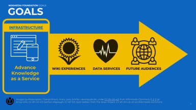
The next goal page repeats the blue framework and includes visible image-contributor credits.
Advance knowledge as a service · Wikimedia Foundation · Page 9
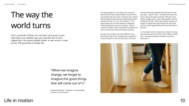
A photograph, quotation and editorial text introduce the chapter's argument about changing home life.
The way the world turns · IKEA / Ingka Group · Page 10