Skip to content
Decks
Slides
Publishers
Saved
Search
Search the archive
Close
Search the archive
Search by title, publisher or design term.
Try
Large type
Two by two
Dark
Search
Menu
Decks
Slides
Publishers
Saved
Slides
Find a page by what it says or how it’s put together.
Search slides
Filter (1)
Publisher
All
Accenture Song
adidas
Airbnb
Apple
Arup
Channel 4
Chipotle
Creative Commons
Deezer
Eventbrite
Figma
IKEA / Ingka Group
Intrepid Travel
Intuit Mailchimp
lululemon
Monzo
National Trust
Nesta
Netflix
Nike
Omidyar Network & Guild of Future Architects
On
Pinterest
Polestar
Reddit
Revolut
Sport England
Spotify
Strava
The LEGO Group
The New York Times Company
TikTok
Trainline
Transport for London
Uber
Universal Music Group
V&A
Vinted
Volvo Cars
WeTransfer
Wikimedia Foundation
Wise
Document type
All
Annual report
Creative report
Investor presentation
Strategy deck
Trend publication
Publication year
All
2026
2025
2024
2022
2021
2019
Narrative role
All
Context
Cover
Evidence
Explanation
Sequence
Layout
All
Large type
Photo-led
Three columns
Two by two
Visual element
All
Bar chart
Body copy
Chart
Diagram
Display type
Framework
Illustration
Photography
Single statistic
Timeline
Style
All
Dark
Editorial
Grid
Minimal
Colour
All
Blue
Green
Monochrome
Purple
Red
Rust
Yellow
Apply filters
Layout: Large type ×
Clear search and filters
40 slides
Sort slides
Freshly hung
Colour
Freshly hung
·
Colour
Grid
List
Light table
Slide results
Impact Report 2025 · lululemon · Page 1
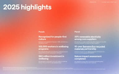
2025 highlights · lululemon · Page 5
Impact Progress Report 2025 · On · Page 1
Sustainability Report 2025 · Polestar · Page 1
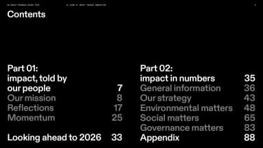
Contents · On · Page 6
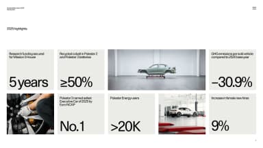
2025 highlights · Polestar · Page 7
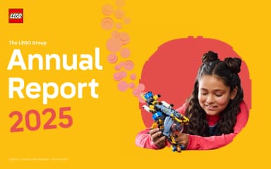
Annual Report 2025 · The LEGO Group · Page 1
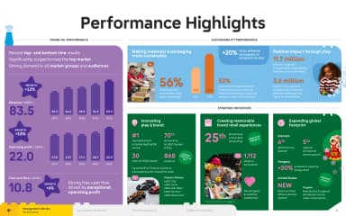
Performance highlights · The LEGO Group · Page 5
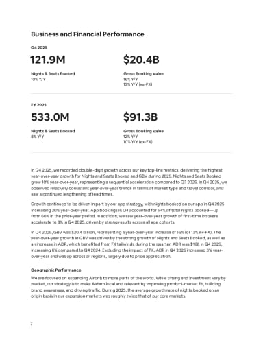
Business and Financial Performance · Airbnb · Page 7
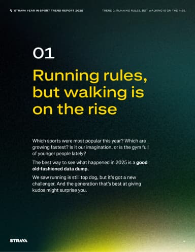
Running rules, walking rises · Strava · Page 4
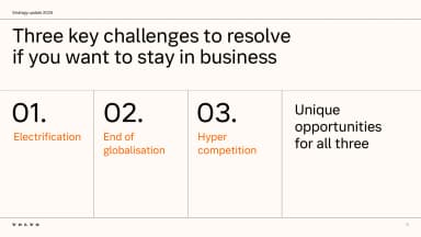
Three key challenges · Volvo Cars · Page 6
Letter to shareholders · Reddit · Page 1
Fearless, funny and free · Channel 4 · Page 1
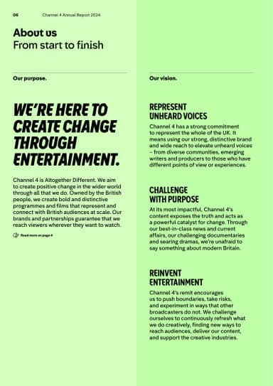
We're here to create change through entertainment · Channel 4 · Page 8
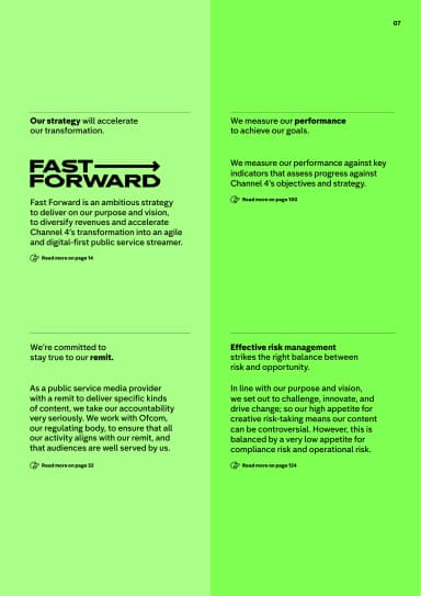
Fast Forward strategy · Channel 4 · Page 9
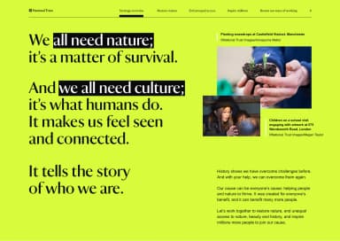
Why nature and culture matter · National Trust · Page 6
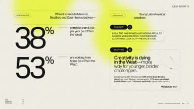
10,000 creative voices · WeTransfer · Page 2
The be-all and end-all of creative reports · WeTransfer · Page 5
Creative careers across markets · WeTransfer · Page 11
The future is fiction · Arup · Page 7
Accenture Life Trends 2025 · Accenture Song · Page 1
Annual Report 2025 · Creative Commons · Page 1
State of the Designer 2025 · Figma · Page 1
Annual Report 2026 · Monzo · Page 1
Equity & Impact Report 2025 · Spotify · Page 1
Creativity for all · V&A · Page 1
Annual Report and Accounts 2025 · Wise · Page 1
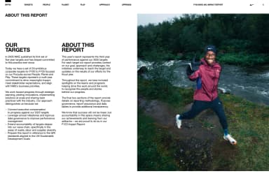
Our targets · Nike · Page 4
The founding purpose · V&A · Page 4
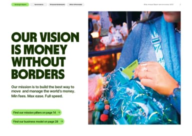
Money without borders · Wise · Page 4
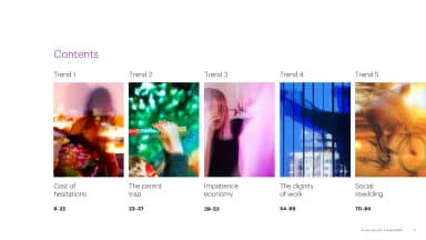
Five trends · Accenture Song · Page 5
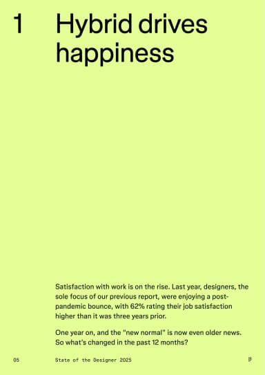
Hybrid drives happiness · Figma · Page 5
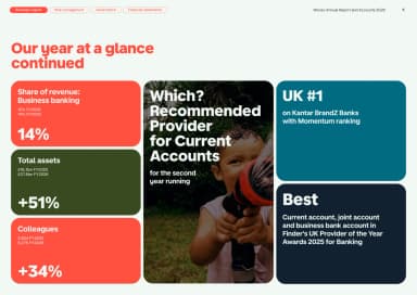
Our year at a glance continued · Monzo · Page 5
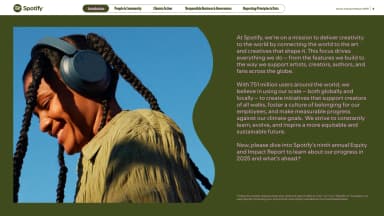
Delivering creativity to the world · Spotify · Page 5
Our vision · V&A · Page 5
Cost of hesitations · Accenture Song · Page 6
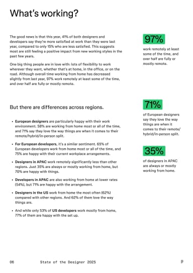
What’s working? · Figma · Page 6
Who we are and why we're here · Monzo · Page 6
Strategic priorities and objectives · V&A · Page 7
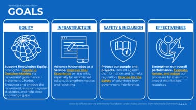
Protect our people and projects · Wikimedia Foundation · Page 8
Save to a collection
Close